

Le Shio
Enhancing usability and visual appeal for a local Asian fusion restaurant
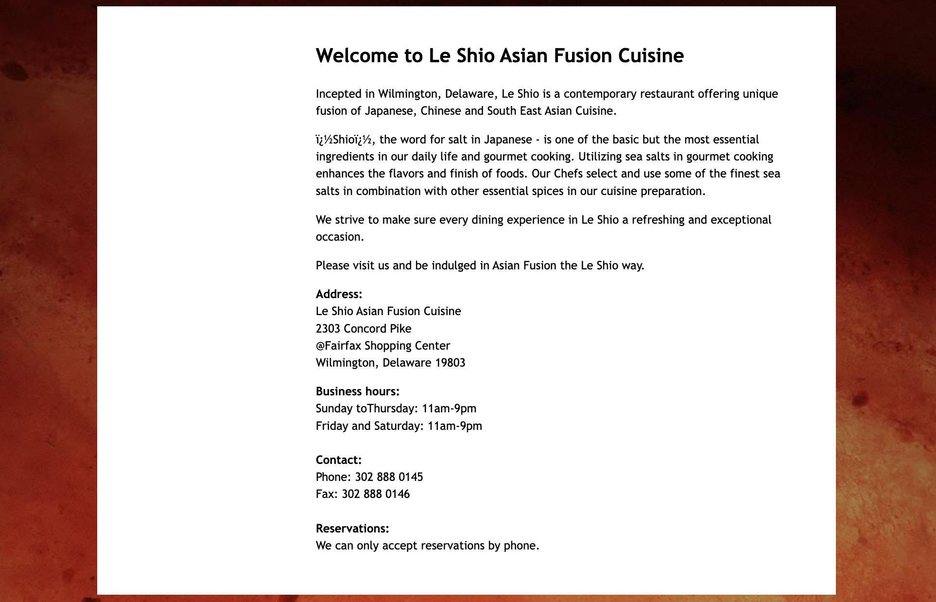
Le Shio is a hometown favorite Asian fusion restaurant whose website lacked usability, clear flow, and visual interest. I redesigned the site to make it more user-friendly, engaging, and reflective of the restaurant's ambiance through bold layouts, refined typography, and interactive elements.
DEMO/LIVE PROTOTYPE
ROLE
Solo UX/UI Designer
TIME
6 Months
TOOLS
Figma
INITIAL RESEARCH
What problem am I trying to solve?
Le Shio’s original website suffered from poor readability, bland typography, lack of layout/visual hierarchy, and interactivity.
These issues made the experience feel static, outdated, and uninviting.

PROBLEM
Understanding the Restaurant Industry

Why is the problem important?
91%
of guests check a restaurant’s website before ordering.
Source: Owner
70%
of consumers have been discouraged from visiting a restaurant due to its website.
Source: Restaurant Dive
30%
of users are discouraged by difficult-to-navigate websites and outdated designs.
Source: Owner
Who am I solving for?
Target Audience
Asian adults aged 18–55, typically food explorers or tech-savvy individuals seeking to view menus or make reservations online.
User Persona
Katherine Li, a 35-year-old working professional who loves discovering Asian fusion restaurants and prioritizes clear online menus and seamless reservation systems.

Site Audit - Key Takeaways
In order to locate areas for improvement and compare strengths with weaknesses, I evaluated the original website.
What worked ✅
Rotating image gallery showcasing ambiance
Well-structured header with intuitive navigation

What didn’t work ❌
Tiny, generic text with little visual contrast
Unbalanced page formatting and awkward spacing
No interactive components outside the hero carousel
PROBLEM STATEMENT
“As a potential diner looking for a new spot, I find it difficult to engage with Le Shio’s website because the layout is confusing, the text is hard to read, and I can’t easily view the menu or make a reservation online.”
REDESIGN GOALS
To focus my work and add intention
1
Introduce layout variety
Utilize empty space creatively through graphic shapes, strategic content blocks, and bold visuals across each page.
2
Create impactful headlines
Move page titles to central focal points and enlarge text for stronger hierarchy and readability.
3
Increase user engagement
Add dynamic elements like image hovers, carousels, animated icons, and interactive forms.
DESIGN PROCESS
Wireframing
Explored multiple desktop, tablet, and mobile wireframes to test layout balance and flow. Iterated based on spacing, content prioritization, and ease of use.


Atomic Design System
To structure my redesign and implement a higher level of organization, I used an atomic design template to section out my color, type, and layout choices. This helped to keep track of all the elements I was working with.
Color Palette
Inspired by Le Shio’s interior:
Primary: Red-orange, golden yellow, dark navy
Secondary: Lighter hues for backgrounds and hover states
Tertiary: Neutral gray for input fields


Layout Approach
Each page has a unique composition, including elements like:
Rotating icons
Background shapes
Creative image arrangements
This helps to avoid visual repetition.
Typography
Ephesis for an elegant logo-style script
Hiragino Kaku Gothic Pro for clear, modern body text

USABILITY TESTING
Heuristic Evaluation
To get an understanding of how my redesign stood on a usability scale, I created an excel sheet with a Nielsen Norman usability heuristic ranking system and shared it with three users in the target audience. Here’s what some users had to say:
“There’s no third-party support of citations or testimonials to check if this information is true.”
“I would suggest adding in the Yelp link or some FAQ’s to help users.”
“Where can I see that the content is up to date and trustworthy?”
My biggest takeaway from this step of the process was that my redesign lacked user trust elements like “last updated” dates or reviews, and needed to have some credibility indicators.
Visual Representation of Areas to Focus On:

FINAL TOUCHES
Wrapping up with evidence-based fixes
Based on the heuristic evaluation, I implemented some changes to my designs. I added:
Micro-interactions (e.g., image hovers, icon animations)
A reservation/contact form
Integrated Google Maps + external review links
I then conducted a second heuristic evaluation with new participants of the target audience for an unbiased response, and got a 100% success rate with a 12/12 usability score across all categories and across all three sizes of my designs!
RESULTS
The redesign fulfilled all initial objectives:
Created varied, eye-catching page layouts
Enhanced content clarity and page hierarchy
Introduced interactivity to increase engagement
This project was my first time fully redesigning a website for all three device sizes. I thoroughly enjoyed the process of balancing creativity and usability through ongoing research, feedback, and iteration.
Check out my redesigns!
TAKEAWAYS
Things that I learned
Redesigning a restaurant experience taught me how important it is to align visual identity with the brand’s personality and target audience. I gained hands-on experience balancing aesthetics with usability — making sure that every design decision, from typography to layout, supported a seamless, inviting experience.
Next Steps
If I were to take this project further, I’d conduct more in-depth usability testing with real customers and restaurant staff to refine the user journey. I’d also explore designing a digital ordering or reservation system that integrates smoothly with the brand identity established in the redesign.