

e.l.f. Shade Finder Interface & Experience Design
Project Overview:
Project Summary:
I created this project for my UX/UI Design Internship at e.l.f. Beauty. I was put on Project Matchmaker, which handled the creation and launch of an AI-powered shade finder, and I worked as a lead UI designer as well as a UX researcher. From an extensive competitive analysis, multiple rounds of iteration, usability testing data-driven improvements, and employee accuracy testing, we were able to create an easy-to-use, convenient, and accurate product for users.
The Problem:
Users needed a way to quickly figure out their foundation shade virtually, without having to figure them out based on little boxes of color. Many users stated, from qualitative user feedback, that they usually go into stores to find their shade since it is difficult to tell from a screen. Because of this, we decided to make an AI-based shade finder app, in which users just have to align and scan their face to receive a shade, to make it more convenient for users.
The Guiding Problem Statement:
“As an online shopper for foundation, tinted products, and concealers, I am unsure what shade best matches my skin because I cannot try on the product in person.”
Research:
Competitive Analysis:
I began this project by creating a detailed, annotated, competitive analysis of other shade finders in the beauty industry. By looking at other face-scanning technologies and flows by competitors like Fenty and NARS, I was able to understand where the strengths and weaknesses were for each experience, and where we could improve our ideas. I also cross-referenced shade-finding quizzes and other virtual experiences related to the topic to understand other business strategies and gain a more extensive view of the competitive landscape.
I took notes from each shade finding flow, highlighting positive and negative features. I then proceeded to write the pros and cons for each flow and ranked them based on the length of the process, usability, and the accuracy of the shade it recommended. The company that had the highest ranking out of my competitive analysis was Fenty, which we used for the inspiration of our shade finder due to its highly efficient, simple, and easy-to-use flow.


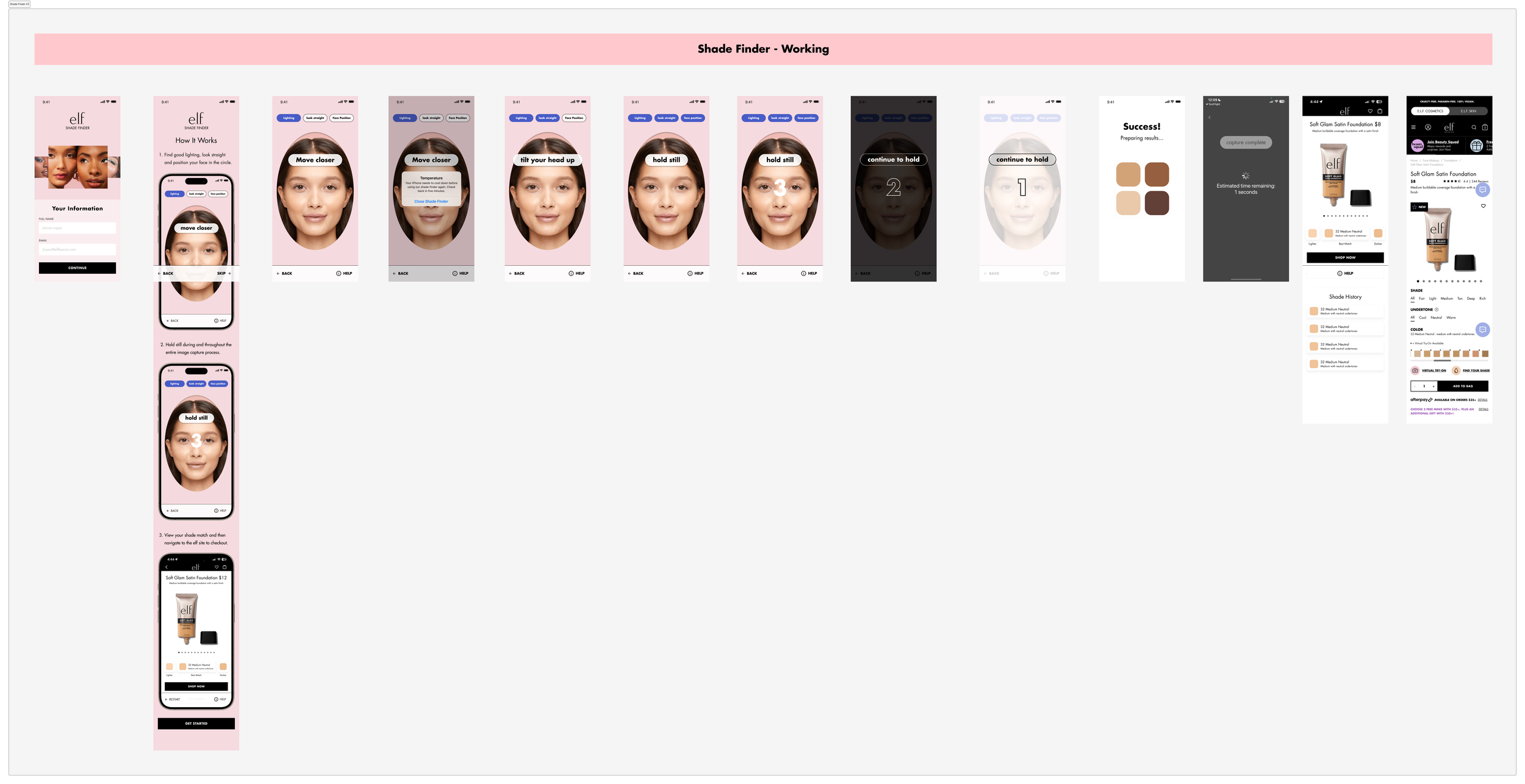
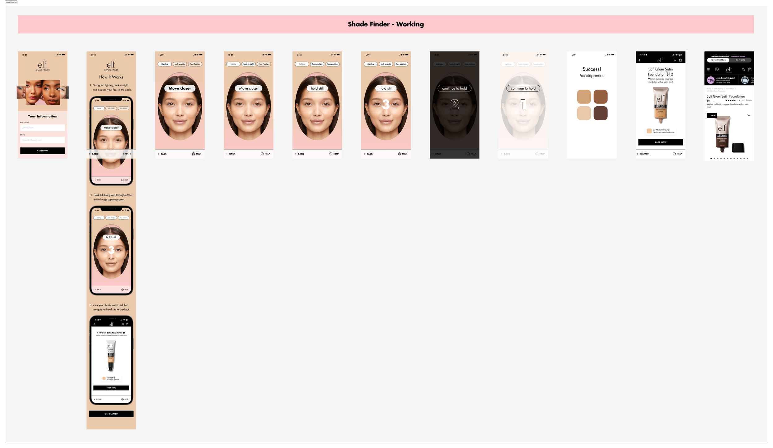
Our Current Flow:
Our current shade-finder had a lot of bugs and confusing steps, which really made the experience frustrating. It had no visual indicators to show that the user had reached the correct process for scanning, unclear directions, and the process took too long overall. All of these factors contributed to an annoying and not accessible user experience, which we knew we needed to fix.

Task Flows:
To address different user scenarios—logged-in vs. guest, first-time users vs. returners—I designed multiple task flows. These flows helped streamline the process and identify potential discrepancies between use cases. We ensured users would experience a consistent and accessible shade-matching journey, regardless of how they interacted with the tool.

Feature Recommendations:
From all the knowledge I gathered on shade-finders across the market and scanning for successful features, I was able to consolidate a list of features to consider adding to e.l.f.’s shade finder and usability recommendations. Some included visual instructions, a virtual try-on after the shade is recommended, three requirements to guide the user to the right scanning conditions, and credibility/captivation.

Design Process:

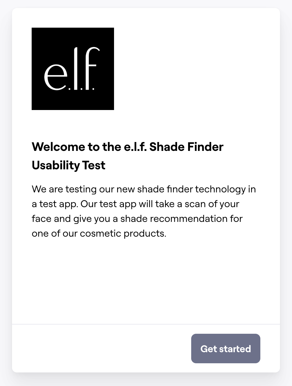
1.) Screener
A few questions to understand the backgrounds of the users - how often they shopped for cosmetics/beauty products and if they’ve ever used an app/website-based shade-finder
2.) Instructions
Shortened the initial instructions and moved the more detailed ones to an easily accessible help button in the scanning stage.

Usability Testing
2.) Instructions
Instructions to access our test app. I included images and gifs to further assist the user with downloading and navigating to our app.


Branding Review:
After completing that flow, we went through a branding review, in which we experimented again with all of our branded colors as backgrounds and success states. Taking inspiration from our site redesign elements as well as other competitors on the market, we gave those as options too. We opted for subtle, branded colors to keep the interface simple and non-distracting.
3.) Scenario
A scenario for users to immerse themselves in before using our product - Imagine you have found a new cosmetic product on the e.l.f. Mobile app, but you’re not sure which shade to purchase. You open the shadefinder to help you make a decision.
4.) Questions
Questions to understand the users’ experience with the shade finder - ranging from multiple choice to opinion scales to open-ended - to get that range of qualitative feedback.

3.) UX Copy
Enhanced and enlightened the user experience with empowering, fun copy to make the process more engaging.

4.) Countdown
Improved the countdown visuals and implemented clearer cues like "Hold Still" before scanning.


Mockups:
To just get a feel of the other successful shade finders, I started creating mockups of them but with our branding - just simple instructions to shade recommendation flow for each.
After also doing an audit of our in-progress site redesign and a live app margin audit, I decided to start taking some inspiration from present elements, because as my manager said, “smart designers reuse, they don’t create.”
From this, I started ideating with different layouts and possibilities of elements to include in our virtual shade-matching experience. I also thought about different ways to indicate that the user has reached the correct position to scan their face.

After several rounds of iteration and landing on a design, I plotted out the entire flow from login to the shade recommendation to see how it would feel. I kept in mind brand consistency with the elements I used, direct instructions that needed to be given to the user, and ways to increase conversion rate, through adding a bold CTA and cross-selling.
Maze:
While simultaneously designing the UI and UX of the shade finder, we implemented a user testing platform to conduct tests and gather feedback regarding our most recent version of the test app that had been developed. I created a usability test that had:

Key Insights:
Positive feedback: Users found the interface intuitive and appreciated the autonomy in finding their shade without the need for assistance
Challenges: Some shade recommendations were inaccurate, leaving users uncertain about their match. Users wanted more detailed visuals and explanations to boost confidence in the results.

Final Touches:

5.) VTO & Confidence
Introduced a virtual try-on option and side-by-side comparisons with actual skin tones for more confidence in shade recommendations.

Results:
Through several rounds of design refinement, usability testing, and stakeholder feedback, we created a user-centric shade finder that was not only visually appealing but significantly more effective. This project increased user engagement, reduced confusion, and elevated the overall e-commerce experience on the e.l.f. platform.
This project deepened my expertise in UX/UI design, e-commerce strategy, and UX research, while honing skills in usability testing, microcopy, and design iteration. It reinforced the importance of user-centered design and collaborative feedback loops in driving successful outcomes.
Stay tuned to see the final shade finder!
Design Decisions:
With this testing data, I went back to the drawing board and made several adjustments.
1.) Credibility Screen
Added a credibility screen explaining the AI technology behind the tool to enhance trust.
